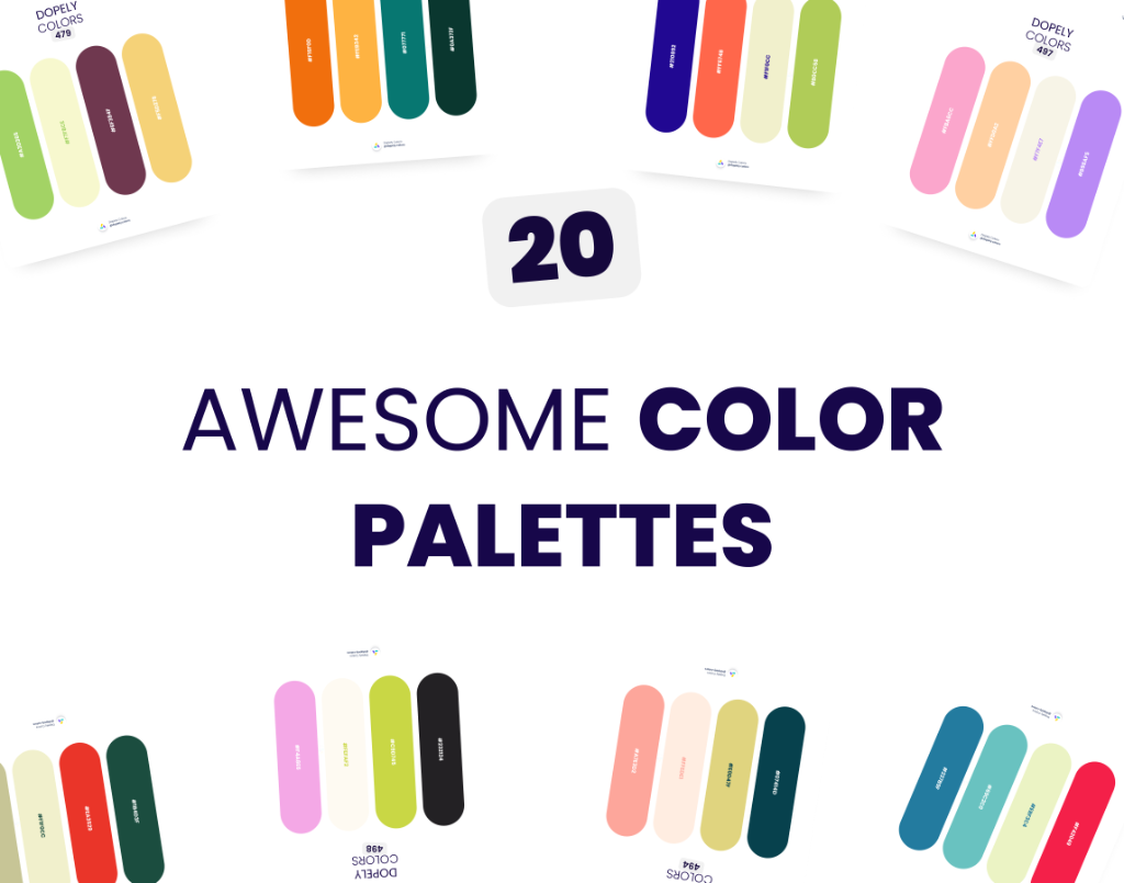
Summer is here — and so is our June 2026 color palette roundup. Every month, the Dopely community surfaces the palettes that designers are actually using across branding, UI, packaging, editorial, and beyond.
This June, we hand-picked 20 awesome color palettes — from earthy rugged tones to electric neons, Mediterranean brights to dreamy pastels. Whatever you're designing, there's a palette here that speaks your language.
Scroll through, copy the hex codes, and find your next color story.
1. Dopely Colors 479 — Garden Party
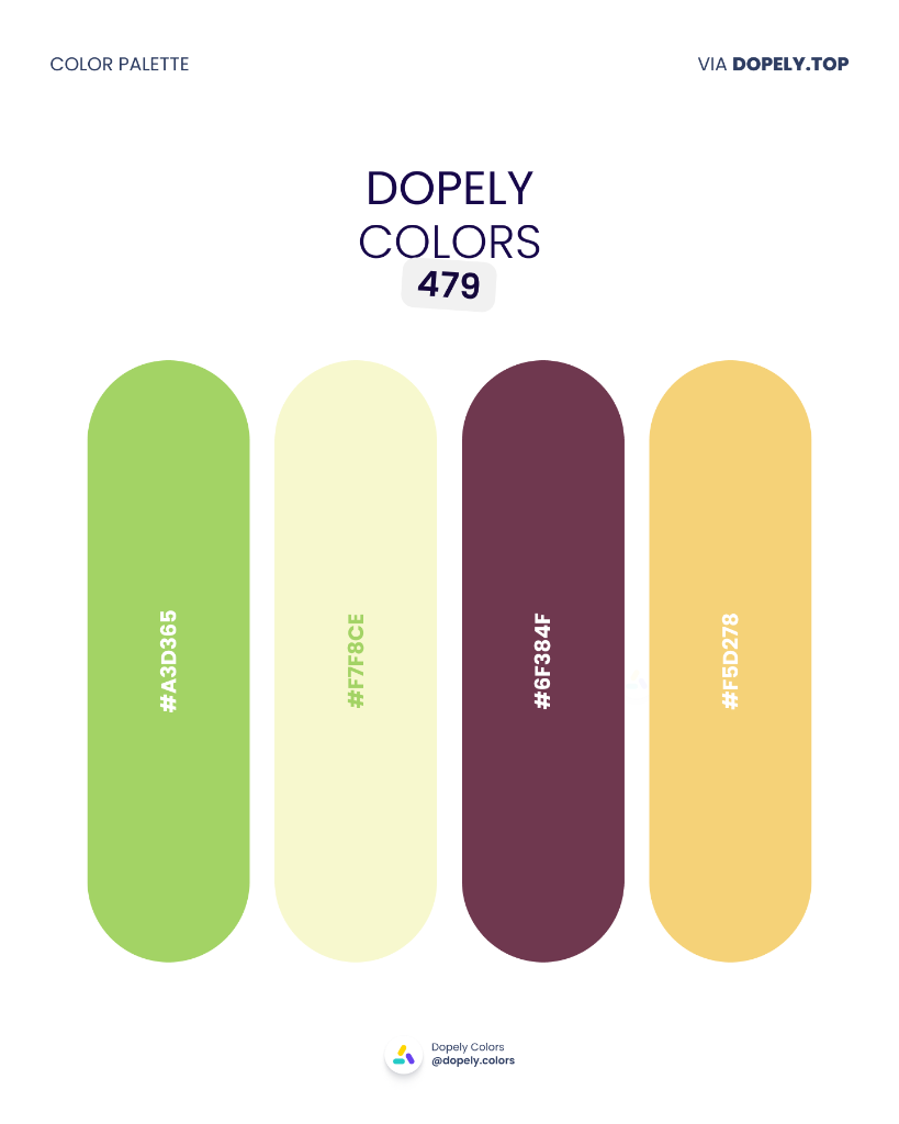
Fresh apple green, pale lemon, deep plum, and warm golden yellow — a playful, garden-fresh combination that brings vitality and contrast. Perfect for food brands, spring campaigns, botanical packaging, or artisan products. The plum grounds the lightness of the other three, keeping it sophisticated.
Palette colors:
- #A3D365 — rgb(163, 211, 101)
- #F7F8CE — rgb(247, 248, 206)
- #6F384F — rgb(111, 56, 79)
- #F5D278 — rgb(245, 210, 120)
2. Dopely Colors 480 — Terrain
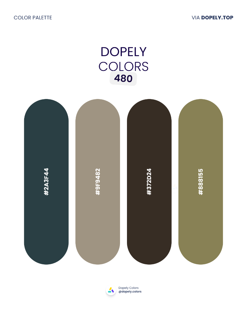
Deep teal-black, warm khaki, espresso brown, and dusty olive — a rugged, earthy palette built for brands rooted in craft and nature. Great for outdoor gear, architectural interiors, artisan coffee, or premium menswear. Every shade here feels hand-worn and honest.
Palette colors:
- #2A3F44 — rgb(42, 63, 68)
- #9F9482 — rgb(159, 148, 130)
- #372D24 — rgb(55, 45, 36)
- #888155 — rgb(136, 129, 85)
3. Dopely Colors 481 — Blue Hour
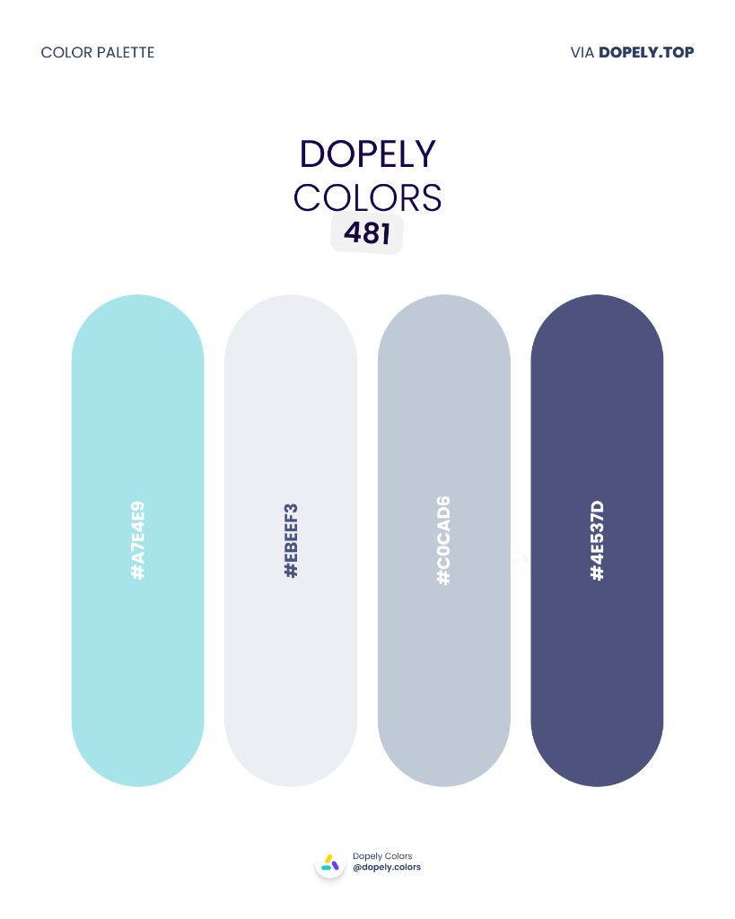
Soft aqua, near-white frost, muted slate, and deep indigo-navy — a tranquil palette that captures the mood between day and night. Ideal for wellness apps, spa branding, digital health platforms, or premium skincare. Calm, refined, and completely trustworthy.
Palette colors:
- #A7E4E9 — rgb(167, 228, 233)
- #EBEEF3 — rgb(235, 238, 243)
- #C0CAD6 — rgb(192, 202, 214)
- #4E537D — rgb(78, 83, 125)
4. Dopely Colors 482 — Harvest Table
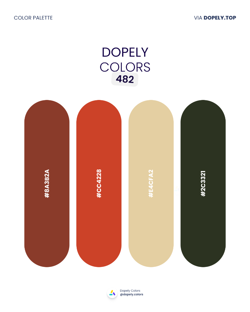
Brick red, burnt orange, wheat cream, and deep forest green — the colors of a well-set autumn table. This palette works beautifully for restaurants, farm-to-table brands, seasonal campaigns, or artisan food packaging. Warm, grounded, and deeply appetizing.
Palette colors:
- #8A3B2A — rgb(138, 59, 42)
- #CC4228 — rgb(204, 66, 40)
- #E4CFA2 — rgb(228, 207, 162)
- #2C3321 — rgb(44, 51, 33)
5. Dopely Colors 483 — Rose Petal
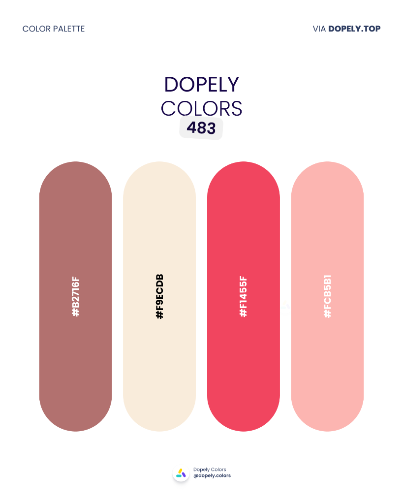
Dusty mauve, warm cream, vivid crimson, and soft blush — a feminine palette with real range. The bold red gives it energy while the softer tones keep it refined. Great for beauty brands, fashion campaigns, Valentine's Day collections, or romantic editorial.
Palette colors:
- #B2716F — rgb(178, 113, 111)
- #F9ECDB — rgb(249, 236, 219)
- #F1455F — rgb(241, 69, 95)
- #FCB5B1 — rgb(252, 181, 177)
6. Dopely Colors 484 — Sundown Jungle
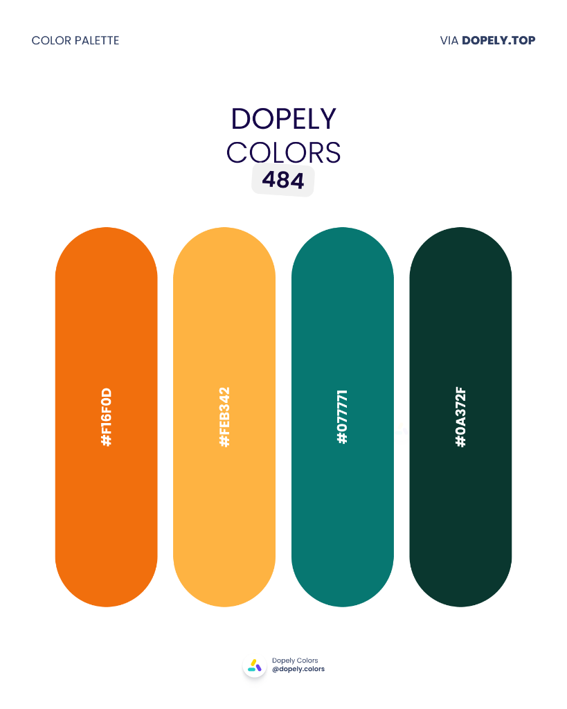
Electric orange, golden amber, deep teal, and forest green — a high-contrast pairing of fire and foliage. This is a palette that commands attention. Perfect for adventure brands, sustainability campaigns, bold editorial, or sports & outdoor products.
Palette colors:
- #F16F0D — rgb(241, 111, 13)
- #FEB342 — rgb(254, 179, 66)
- #077771 — rgb(7, 119, 113)
- #0A372F — rgb(10, 55, 47)
7. Dopely Colors 485 — Bark & Stone
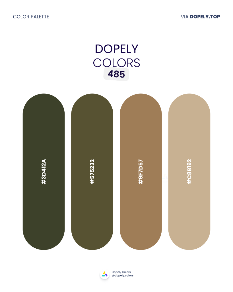
Dark forest olive, earthy moss, warm tan, and sand beige — a monochromatic natural palette moving from shadow to light. Made for architecture, heritage fashion, organic skincare, or any brand that wants to feel rooted and enduring.
Palette colors:
- #3D412A — rgb(61, 65, 42)
- #575232 — rgb(87, 82, 50)
- #9F7D57 — rgb(159, 125, 87)
- #C8B192 — rgb(200, 177, 146)
8. Dopely Colors 486 — Velvet Spice
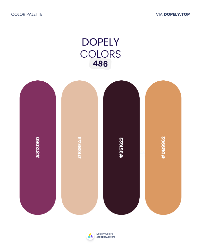
Deep magenta-purple, warm blush, near-black wine, and spiced amber — rich, warm, and theatrical. Built for luxury perfume, heritage wine labels, premium chocolate brands, or bold editorial design. This palette has depth and drama in equal measure.
Palette colors:
- #813060 — rgb(129, 48, 96)
- #E3BEA4 — rgb(227, 190, 164)
- #351623 — rgb(53, 22, 35)
- #DB9962 — rgb(219, 153, 98)
9. Dopely Colors 487 — Emerald & Wine
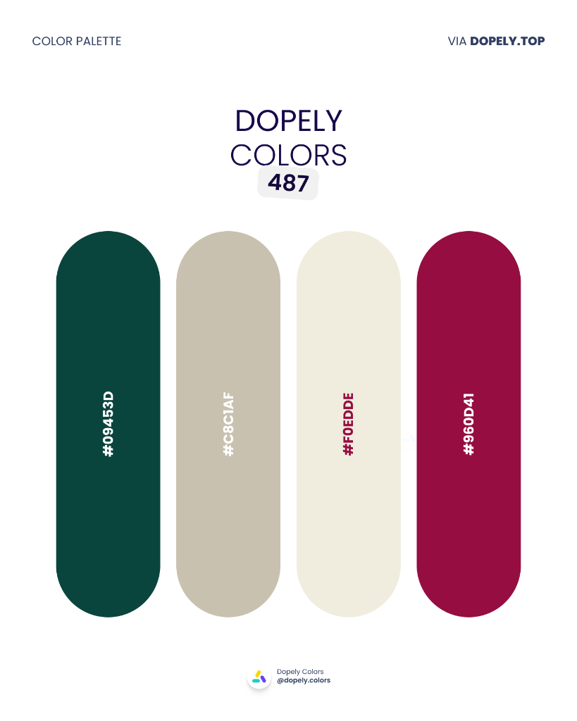
Deep emerald green, warm pebble grey, soft ivory, and rich crimson — a combination that feels curated and timeless. Perfect for fine dining, premium hospitality, wedding brands, or any luxury product that values tradition with a modern edge.
Palette colors:
- #09453D — rgb(9, 69, 61)
- #C8C1AF — rgb(200, 193, 175)
- #F0EDDE — rgb(240, 237, 222)
- #960D41 — rgb(150, 13, 65)
10. Dopely Colors 488 — City Garden
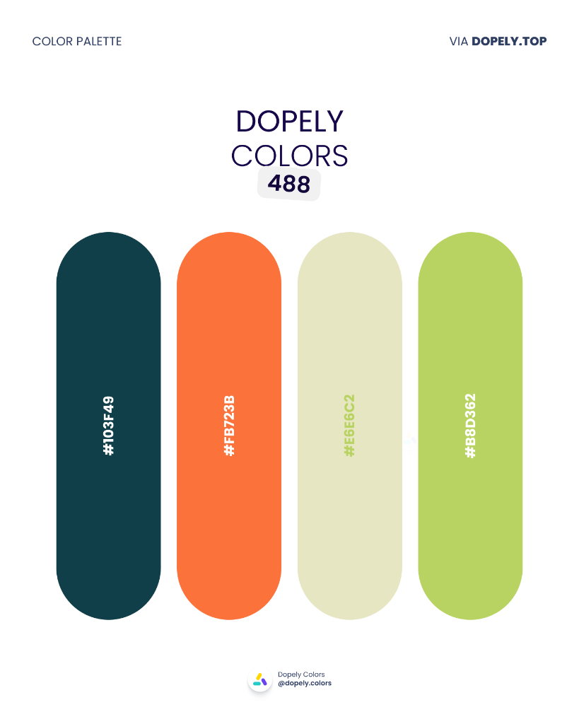
Dark teal, bold orange, soft sage cream, and bright lime green — an urban-meets-nature palette full of energy and optimism. Great for tech startups, sustainability brands, lifestyle apps, or modern restaurant concepts. Fresh and forward-looking.
Palette colors:
- #103F49 — rgb(16, 63, 73)
- #FB723B — rgb(251, 114, 59)
- #E6E6C2 — rgb(230, 230, 194)
- #B8D362 — rgb(184, 211, 98)
Design Smarter with Dopely
The best palette is the one built for your project — not just the prettiest one on the internet. That's where Dopely's tools come in.
Color Studio — Start with any color, lock it, and let Dopely generate harmonious companions. Adjust, remix, and export in seconds.
Color Assist (AI) — Describe your brand, project, or mood in plain English, and Arya — Dopely's AI — crafts palettes tailored to your brief. "A sustainable food brand with earthy confidence" becomes a ready-to-use palette in seconds.
Discover — Filter thousands of community palettes by mood, industry, season, or specific color. Save favorites to your profile and build from real designer work.
Contrast Checker & Accessibility Suite — Before you ship, make sure your palette actually works. Test WCAG contrast ratios, simulate color blindness, and validate every combination.
11. Dopely Colors 489 — Morning Mist
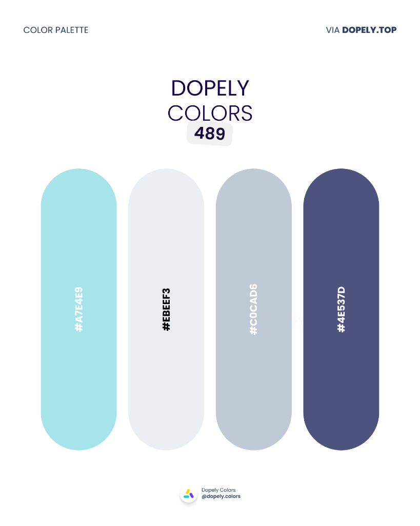
A cool, airy blue monochrome — from aqua mint to pale frost to slate and deep navy. This palette breathes calm authority. Ideal for healthcare, digital wellness, fintech, or any brand where trust and clarity are non-negotiable.
Palette colors:
- #A7E4E9 — rgb(167, 228, 233)
- #EBEEF3 — rgb(235, 238, 243)
- #C0CAD6 — rgb(192, 202, 214)
- #4E537D — rgb(78, 83, 125)
12. Dopely Colors 490 — Electric Bloom
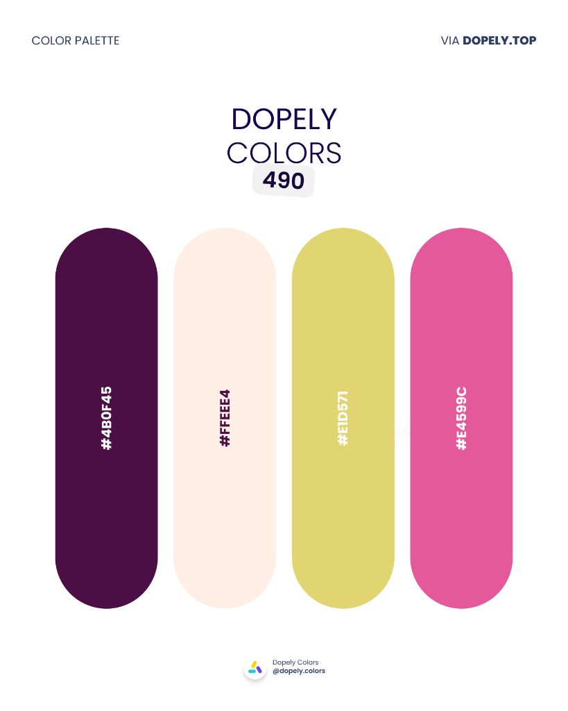
Deep eggplant purple, soft blush cream, chartreuse yellow, and hot pink — a maximalist palette with serious attitude. This one is built for music festivals, fashion-forward brands, Gen-Z campaigns, or any creative project that refuses to be ignored.
Palette colors:
- #4B0F45 — rgb(75, 15, 69)
- #FFEEE4 — rgb(255, 238, 228)
- #E1D571 — rgb(225, 213, 113)
- #E4599C — rgb(228, 89, 156)
13. Dopely Colors 491 — Primary Plus
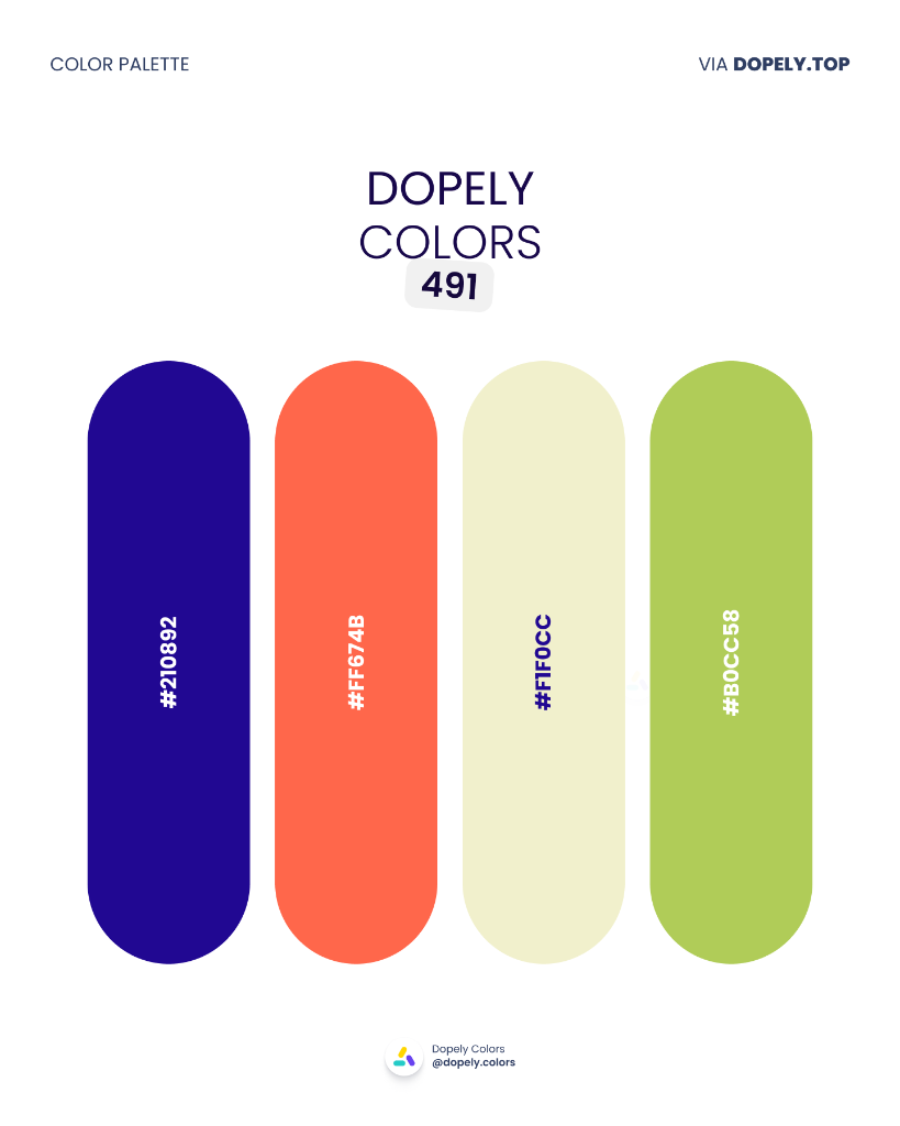
Electric indigo, vivid coral-red, pale cream, and fresh lime — a neo-primary palette with a modern remix. Think graphic design, bold branding, poster art, or editorial work that wants to reference Mondrian without copying him.
Palette colors:
- #210892 — rgb(33, 8, 146)
- #FF674B — rgb(255, 103, 75)
- #F1F0CC — rgb(241, 240, 204)
- #B0CC58 — rgb(176, 204, 88)
14. Dopely Colors 492 — Riviera
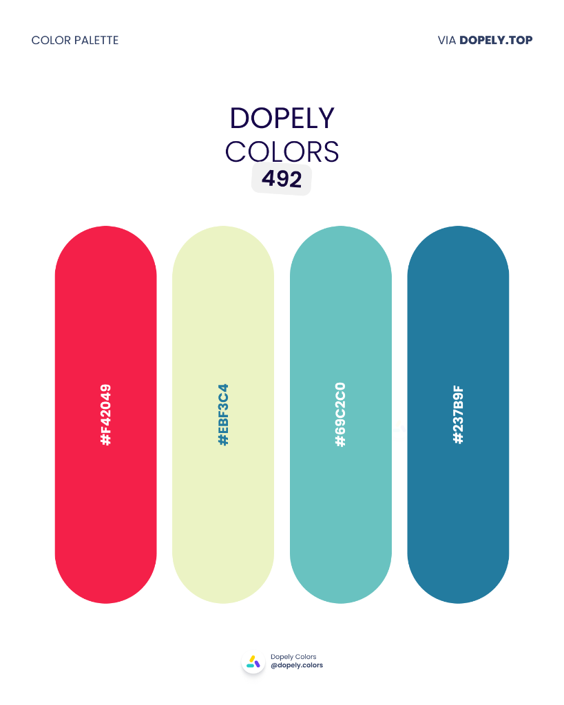
Crimson red, pale lime, aqua teal, and ocean blue — a summery, Mediterranean-inspired combination. Perfect for travel brands, beach hospitality, summer fashion, or any campaign that wants to evoke sun, sea, and ease.
Palette colors:
- #F42049 — rgb(244, 32, 73)
- #EBF3C4 — rgb(235, 243, 196)
- #69C2C0 — rgb(105, 194, 192)
- #237B9F — rgb(35, 123, 159)
15. Dopely Colors 493 — Red Earth
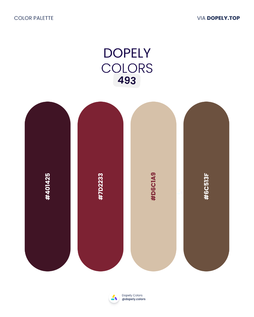
Near-black burgundy, deep wine red, sandy beige, and warm brown — a palette pulled from ancient terracotta and aged leather. Ideal for heritage fashion, fine whiskey labels, artisan leather goods, or historical editorial. Dark, rooted, and rich.
Palette colors:
- #401425 — rgb(64, 20, 37)
- #7D2233 — rgb(125, 34, 51)
- #D6C1A9 — rgb(214, 193, 169)
- #6C513F — rgb(108, 81, 63)
16. Dopely Colors 494 — Tropical Dusk
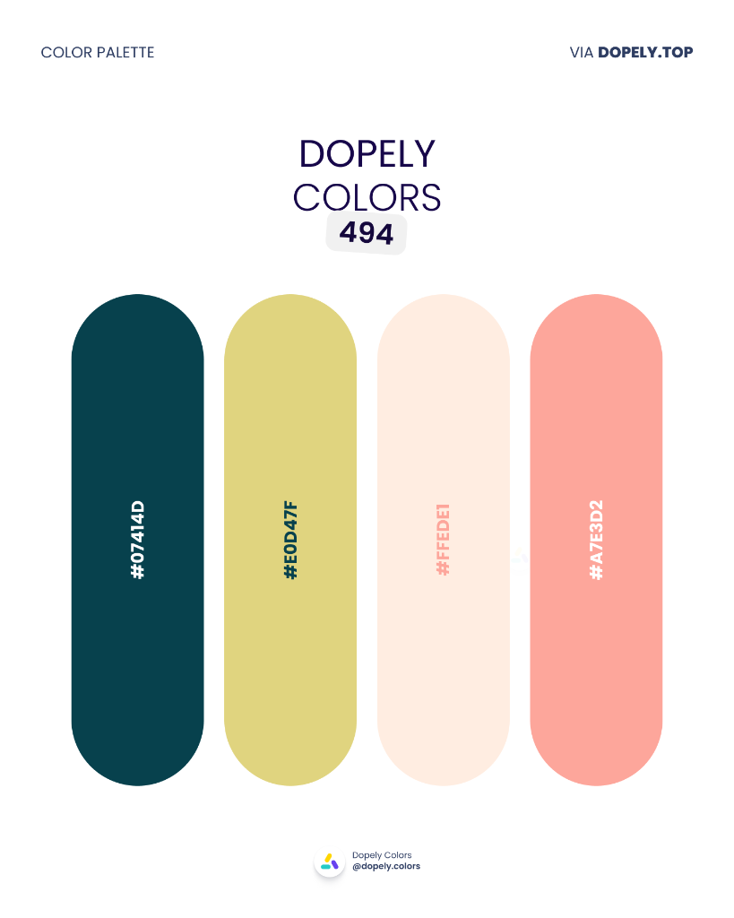
Deep jungle teal, warm olive-gold, pale blush, and soft aqua — the colors of a tropical sunset. Beautiful for resort branding, wellness retreats, cosmetic packaging, or lifestyle brands that evoke escape and renewal.
Palette colors:
- #07414D — rgb(7, 65, 77)
- #E0D47F — rgb(224, 212, 127)
- #FFEDE1 — rgb(255, 237, 225)
- #A7E3D2 — rgb(167, 227, 210)
17. Dopely Colors 495 — Carnival
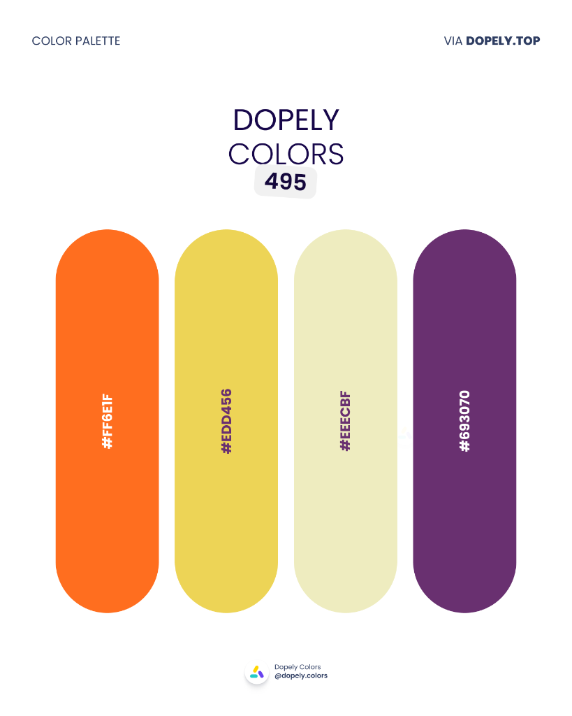
Bold orange, sunflower yellow, pale cream, and deep purple — a festive, high-energy palette that radiates joy. Perfect for events, children's brands, creative agencies, food festivals, or any project that wants to feel celebratory and alive.
Palette colors:
- #FF6E1F — rgb(255, 110, 31)
- #EDD456 — rgb(237, 212, 86)
- #EEECBF — rgb(238, 236, 191)
- #693070 — rgb(105, 48, 112)
18. Dopely Colors 496 — Italian Flag
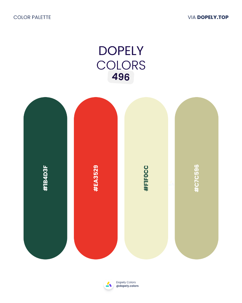
Forest green, tomato red, pale cream, and warm sage — a palette with Mediterranean roots and modern sensibility. Works for Italian food brands, organic grocery, farm-fresh restaurants, or any identity that wants to feel authentic and appetite-stimulating.
Palette colors:
- #1B4D3F — rgb(27, 77, 63)
- #EA3529 — rgb(234, 53, 41)
- #F1F0CC — rgb(241, 240, 204)
- #C7C596 — rgb(199, 197, 150)
19. Dopely Colors 497 — Cotton Candy
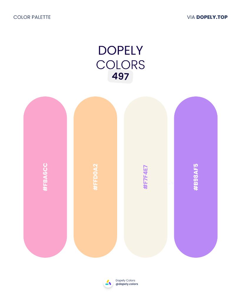
Bubblegum pink, peach orange, warm white, and soft lavender — a dreamy pastel palette that feels light as air. Perfect for beauty brands, lifestyle apps, confectionery, baby products, or any design that should feel gentle, joyful, and inviting.
Palette colors:
- #FBA6CC — rgb(251, 166, 204)
- #FFD0A2 — rgb(255, 208, 162)
- #F7F4E7 — rgb(247, 244, 231)
- #B98AF5 — rgb(185, 138, 245)
20. Dopely Colors 498 — Neon Garden
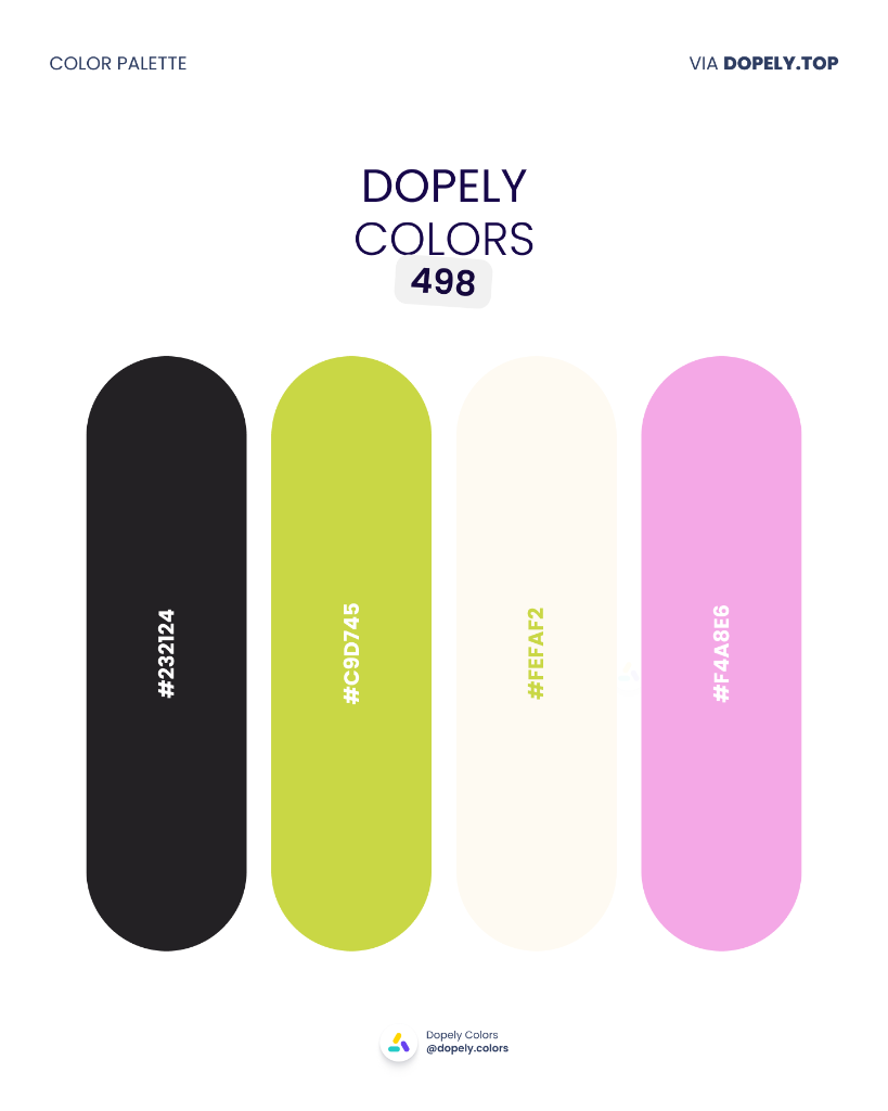
Near-black charcoal, electric lime-green, warm off-white, and soft orchid pink — a palette that pairs dark minimalism with neon accents. Built for creative studios, streetwear brands, music production, or any brand that lives at the intersection of edgy and playful.
Palette colors:
- #232124 — rgb(35, 33, 36)
- #C9D745 — rgb(201, 215, 69)
- #FEFAF2 — rgb(254, 250, 242)
- #F4A8E6 — rgb(244, 168, 230)
Final Thoughts
Twenty palettes. Infinite applications.
Whether you fell for the drama of Velvet Spice (486), the freshness of City Garden (488), or the pure joy of Cotton Candy (497) — remember that a great palette solves a problem. It sets a tone, earns trust, and makes your audience feel something before a single word is read.
Used one of these in a project? Share it on Instagram or Behance and tag @dopely.colors — we feature the best community work every week.
See you in July.
All palettes are sourced from the Dopely community. HEX codes read directly from the original palette cards.