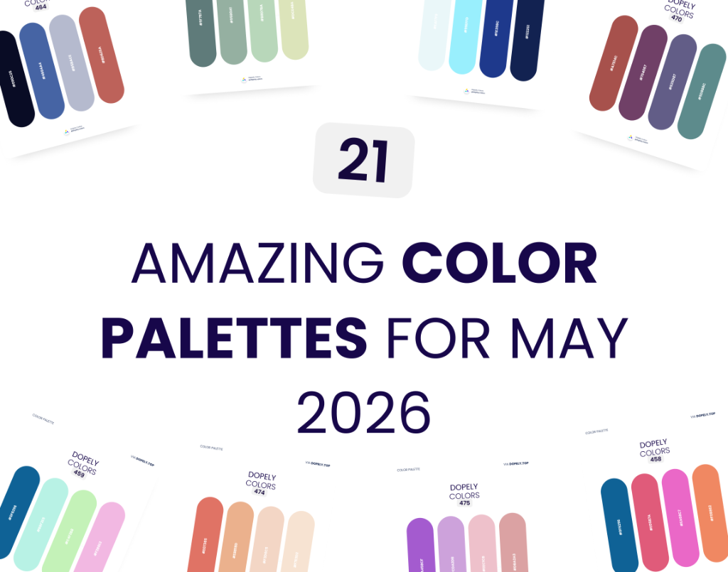
Color is more than aesthetics — it's the first language your brand speaks. Every month, the Dopely community curates a fresh batch of hand-picked palettes used by real designers across branding, UI, illustration, and editorial work.
This May 2026, we're sharing 21 stunning color palettes — from bold Bauhaus-inspired combinations to soft earthy neutrals and electric Gen-Z brights. Whether you're designing a brand identity, a mobile app, or a social campaign, there's something here for you.
Browse each palette below, copy the HEX codes directly, and get inspired.
1. Dopely Colors 458 — Ocean Pop
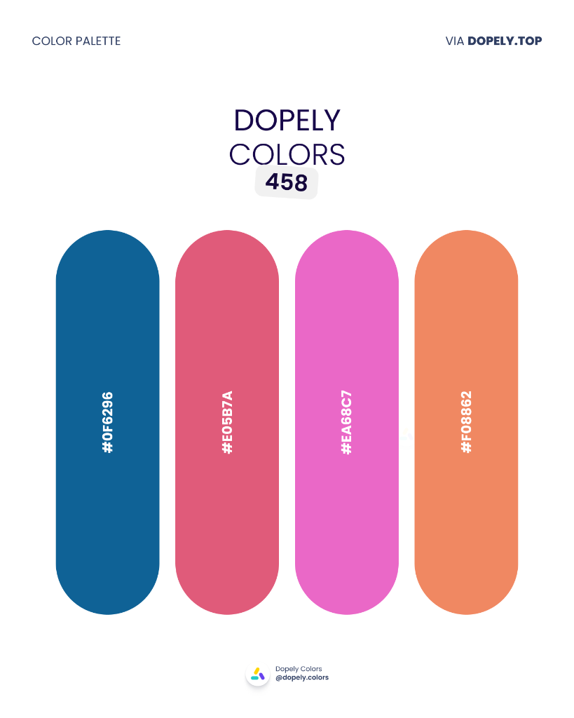
A bold clash of deep ocean blue against vivid pinks and warm coral. This palette is built for brands that want to project both energy and trust simultaneously — think health apps, modern fashion labels, or summer campaigns. The strong contrast between navy and hot pink guarantees visibility in any medium.
Palette colors:
- #0F6296 — rgb(15, 98, 150)
- #E05B7A — rgb(224, 91, 122)
- #EA68C7 — rgb(234, 104, 199)
- #F08862 — rgb(240, 136, 98)
2. Dopely Colors 459 — Spring Shore
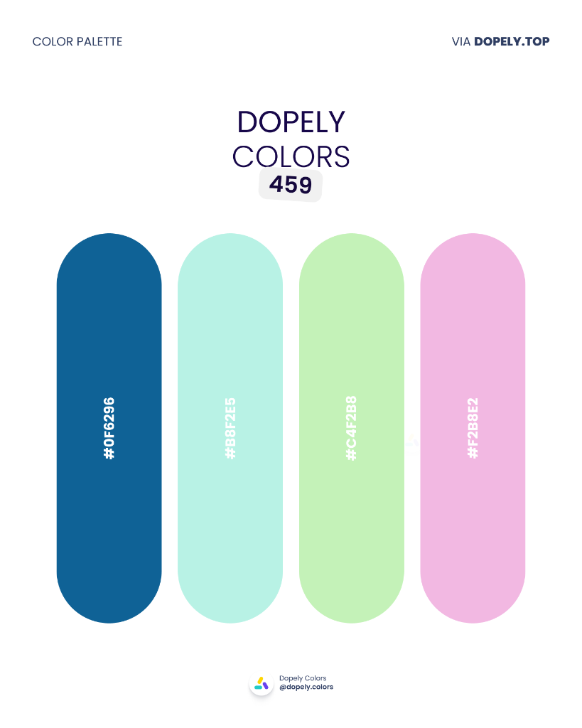
A spring palette with depth — the deep blue anchors a trio of mint, sage, and blush pastels. Ideal for eco brands, wellness apps, or organic packaging. It communicates lightness without feeling naive, and trust without feeling corporate.
Palette colors:
- #0F6296 — rgb(15, 98, 150)
- #B8F2E5 — rgb(184, 242, 229)
- #C4F2B8 — rgb(196, 242, 184)
- #F2B8E2 — rgb(242, 184, 226)
3. Dopely Colors 460 — Harvest Fire
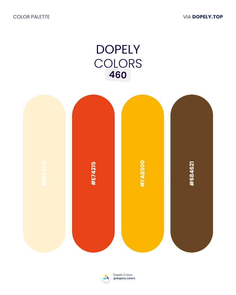
The warmth of autumn with a fiery twist. Creamy white, burnt orange-red, golden yellow, and warm brown — this combination was made for restaurants, food brands, autumn campaigns, or masterclass posters. It's as appetizing as it is visually striking.
Palette colors:
- #FFF2D0 — rgb(255, 242, 208)
- #E74215 — rgb(231, 66, 21)
- #FAB500 — rgb(250, 181, 0)
- #684621 — rgb(104, 70, 33)
4. Dopely Colors 461 — Coastal Gold
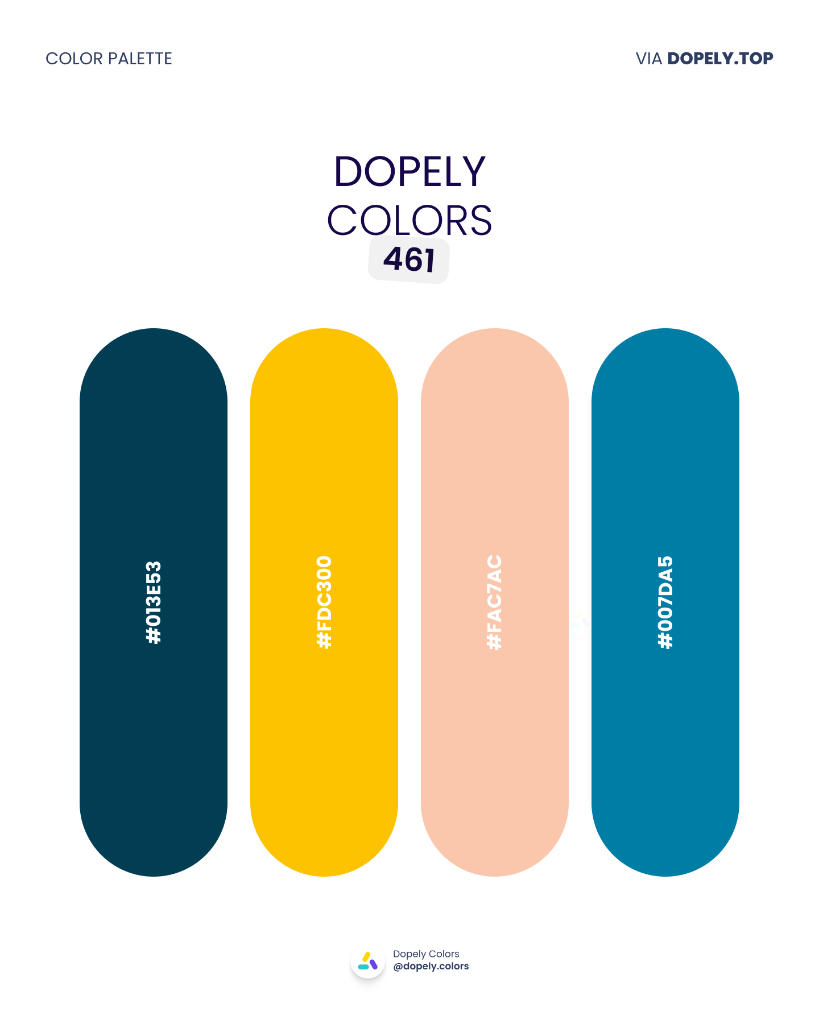
A modern nautical palette: deep pine blue, radiant gold, warm peach, and ocean teal. Perfect for luxury brands, summer apparel, or coastal interior design. These four together strike a refined warmth — upscale without being cold.
Palette colors:
- #013E53 — rgb(1, 62, 83)
- #FDC300 — rgb(253, 195, 0)
- #FAC7AC — rgb(250, 199, 172)
- #007DA5 — rgb(0, 125, 165)
5. Dopely Colors 462 — Bauhaus Bold
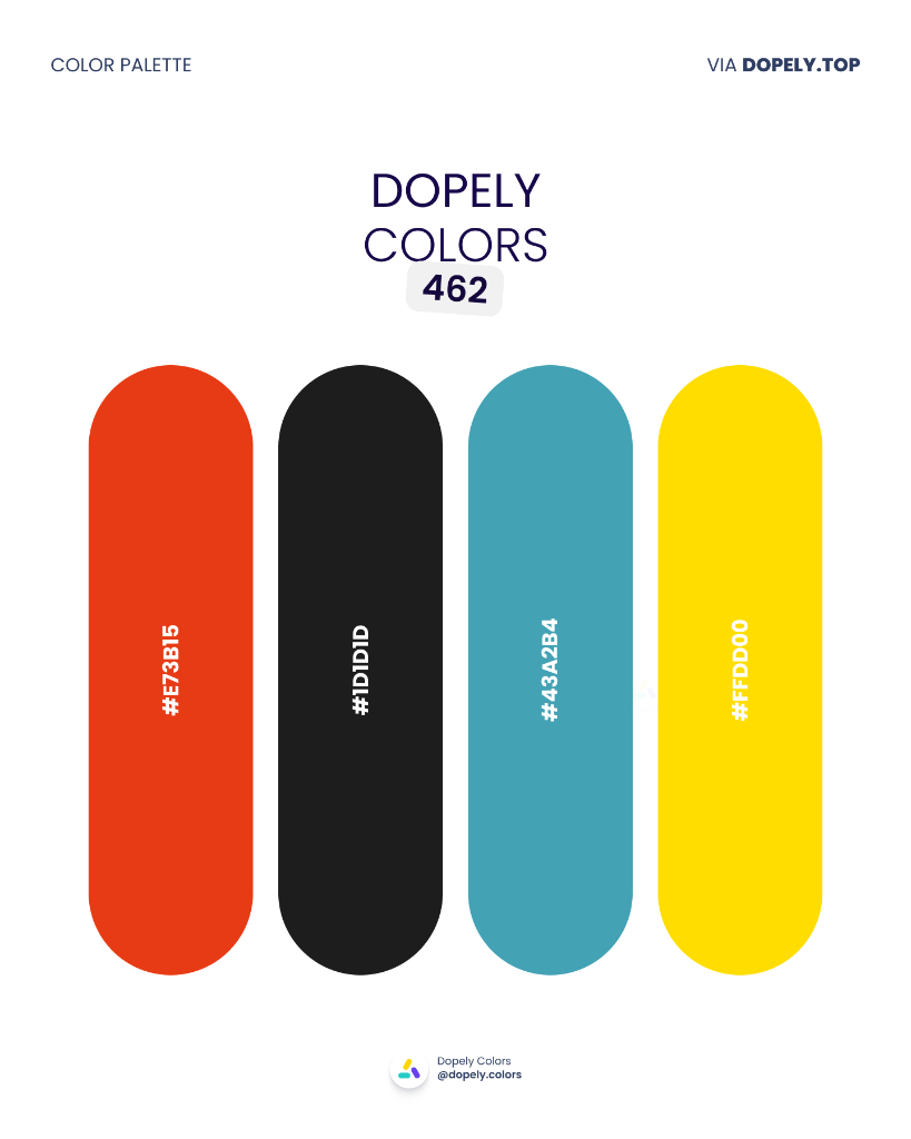
If Bauhaus had a signature palette, this would be it. Fiery red, pure black, industrial teal, and billboard yellow — the most commanding combination in this collection. Built for bold branding, graphic posters, or dark-mode UI. No decoration, just pure intention.
Palette colors:
- #E73B15 — rgb(231, 59, 21)
- #1D1D1D — rgb(29, 29, 29)
- #43A2B4 — rgb(67, 162, 180)
- #FFDD00 — rgb(255, 221, 0)
6. Dopely Colors 463 — Night Latte
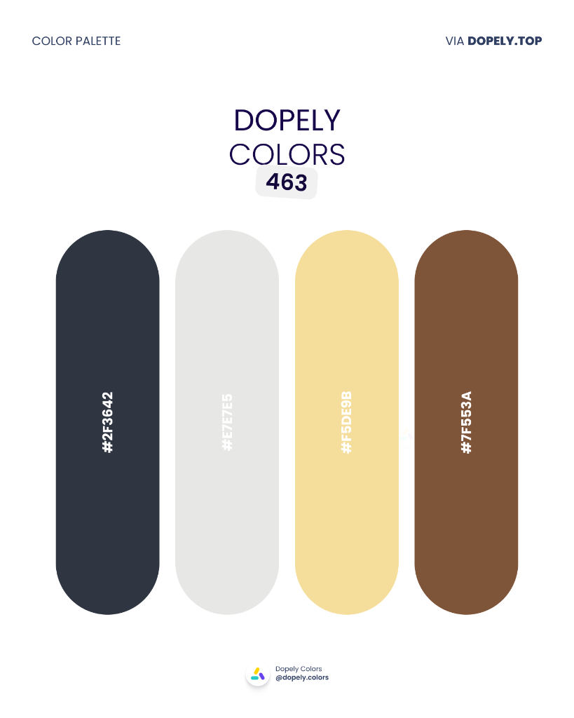
A calm and refined palette: dark navy, pearl grey, candlelight yellow, and caramel brown. Ideal for coffee shops, meditation apps, bookstores, or cozy interior design. It's warm and composed without feeling heavy.
Palette colors:
- #2F3642 — rgb(47, 54, 66)
- #E7E7E5 — rgb(231, 231, 229)
- #F5DE9B — rgb(245, 222, 155)
- #7F553A — rgb(127, 85, 58)
7. Dopely Colors 464 — Midnight Terracotta
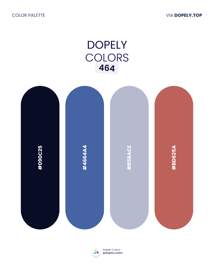
A sophisticated blend of near-black navy, mid-tone denim blue, dusty lavender, and warm terracotta. Great for minimal fashion, fintech, or editorial design. This palette says "we know what we're doing" without shouting it.
Palette colors:
- #090C25 — rgb(9, 12, 37)
- #4664A4 — rgb(70, 100, 164)
- #B5BACE — rgb(181, 186, 206)
- #BD625A — rgb(189, 98, 90)
8. Dopely Colors 465 — Royal Dust
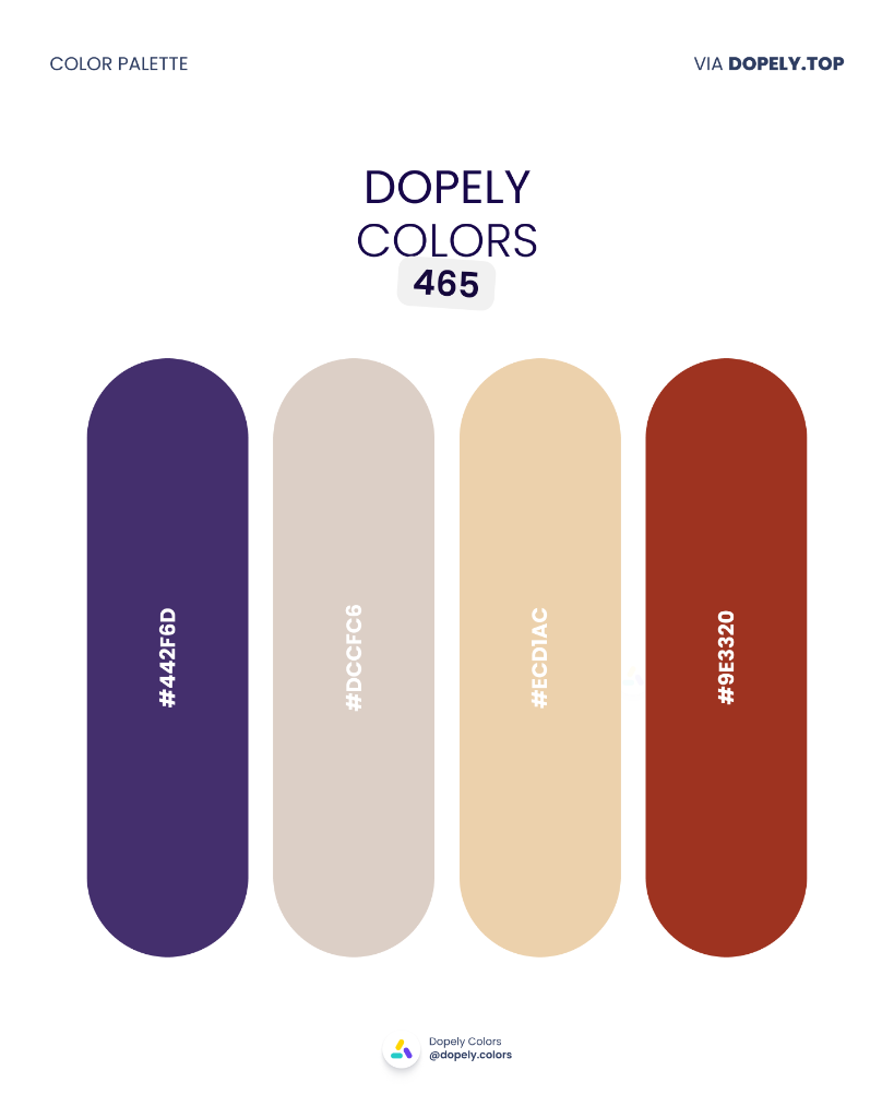
Royal purple meets sandy beige, warm cream, and brick red — a mix that feels both historical and contemporary. Perfect for art brands, museums, heritage fashion, or perfumery. It's not nostalgic — it's timeless.
Palette colors:
- #442F6D — rgb(68, 47, 109)
- #DCCFC6 — rgb(220, 207, 198)
- #ECD1AC — rgb(236, 209, 172)
- #9E3320 — rgb(158, 51, 32)
9. Dopely Colors 466 — Forest Fade
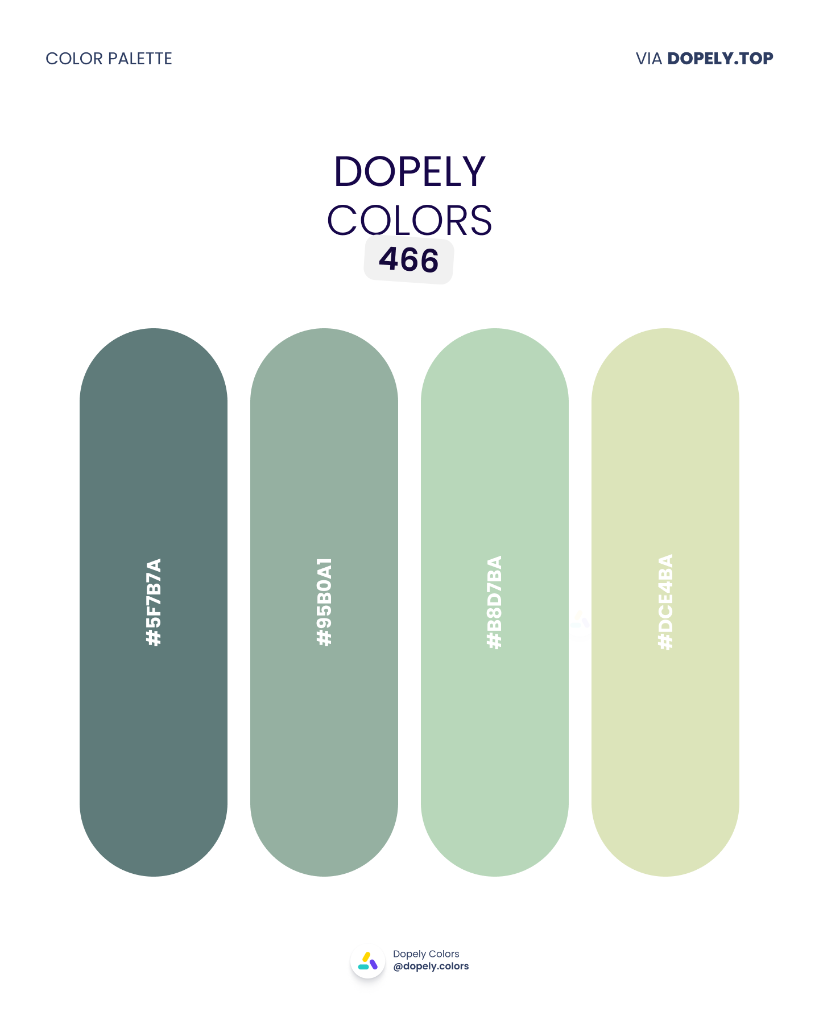
A natural green monochrome fading from deep sage to soft mint. Perfect for eco brands, natural beauty, meditation apps, or botanical packaging. Four colors, one mood: pure calm.
Palette colors:
- #5F7B7A — rgb(95, 123, 122)
- #95B0A1 — rgb(149, 176, 161)
- #B8D7BA — rgb(184, 215, 186)
- #DCE4BA — rgb(220, 228, 186)
10. Dopely Colors 467 — Retro Republic
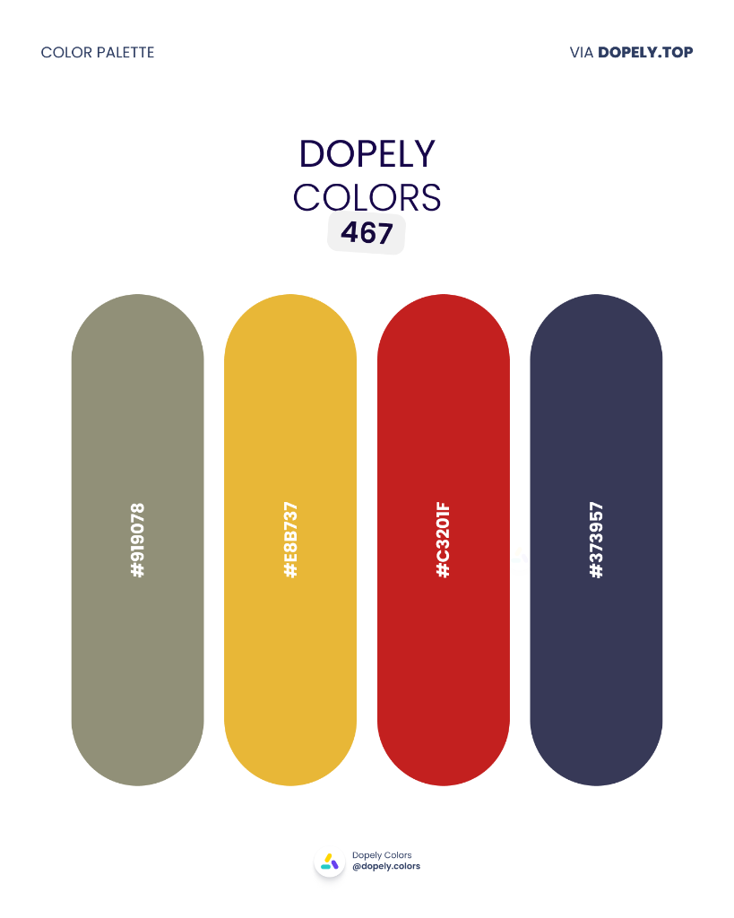
Khaki olive, mustard yellow, classic red, and deep navy — a retro palette that earns its vintage feel. Great for poster art, artisan brands, jazz music, or rugged menswear. When you want to be authentic, not just nostalgic.
Palette colors:
- #919078 — rgb(145, 144, 120)
- #E8B737 — rgb(232, 183, 55)
- #C3201F — rgb(195, 32, 31)
- #373957 — rgb(55, 57, 87)
Build Your Own Palette with Dopely
You don't have to wait for next month's collection. With Color Studio, you can curate, generate, and fine-tune your own palettes in real time — with AI assistance that understands color harmony, contrast, and brand tone.
Color Studio — Pick colors, lock the ones you love, and let Dopely suggest the rest. Mix, adjust, and export in seconds.
Color Assist (AI) — Just describe your project: "a luxury wellness brand with earthy tones" or "a fintech app that feels trustworthy but modern" — Arya, Dopely's AI, generates palettes tailored to your brief.
Discover — Browse thousands of community palettes filtered by mood, industry, season, or color. Save what you love to your profile and build from there.
These aren't just tools — they're a complete workflow. Start with inspiration from Discover, refine it in Color Studio, validate contrast with the Accessibility Checker, and export production-ready tokens with the Design Token Generator. All in one place.
11. Dopely Colors 468 — Linen & Sage
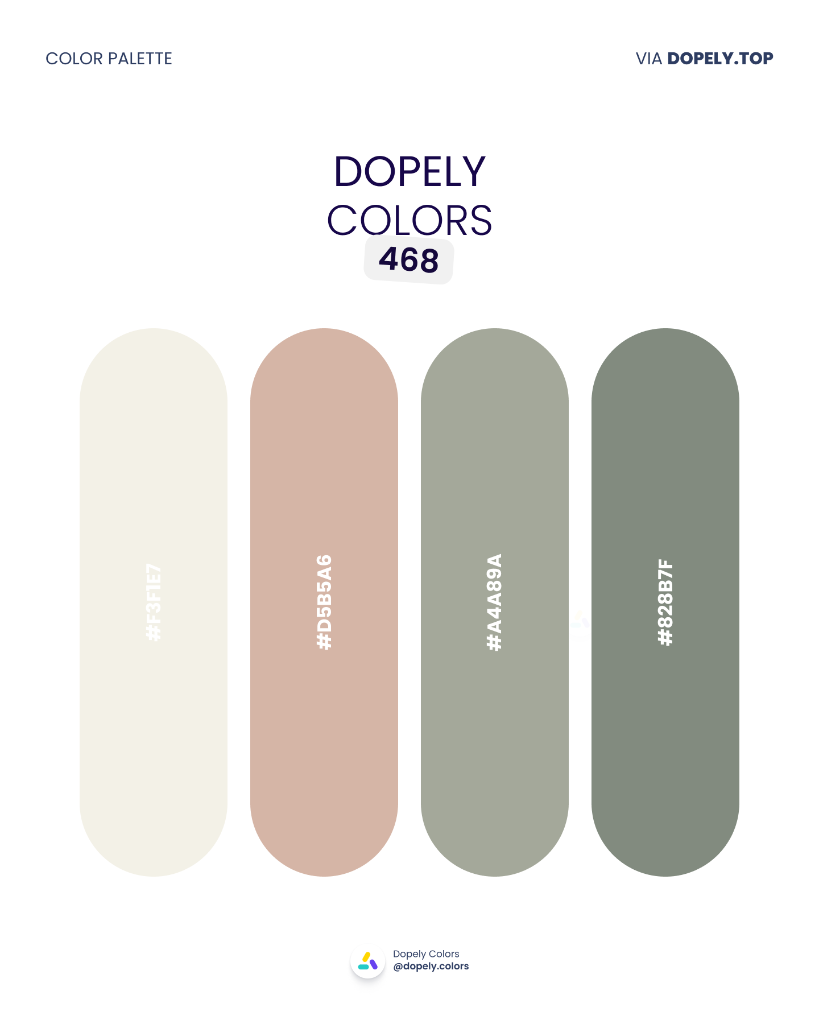
Linen white, dusty rose, sage grey, and muted olive — a set of modern neutrals that never feel boring. Made for interior design, minimal fashion, editorial photography, or clean-aesthetic brands. The ideal backdrop for simple sophistication.
Palette colors:
- #F3F1E7 — rgb(243, 241, 231)
- #D5B5A6 — rgb(213, 181, 166)
- #A4A89A — rgb(164, 168, 154)
- #828B7F — rgb(130, 139, 127)
12. Dopely Colors 469 — Deep Grove
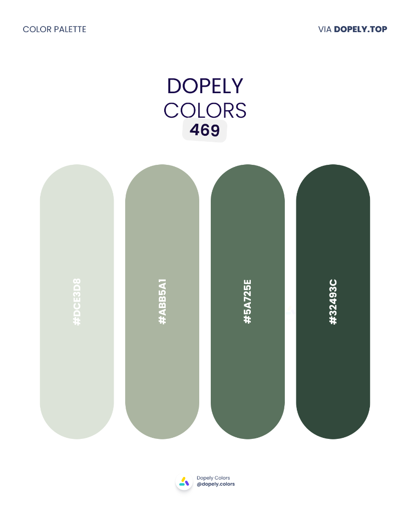
From misty morning green to deep forest dark — a natural monochrome with real depth. Ideal for outdoor brands, ecotourism, tea packaging, or organic skincare. It brings nature into the brand identity.
Palette colors:
- #DCE3D8 — rgb(220, 227, 216)
- #ABB5A1 — rgb(171, 181, 161)
- #5A725E — rgb(90, 114, 94)
- #32493C — rgb(50, 73, 60)
13. Dopely Colors 470 — Dusk Spectrum
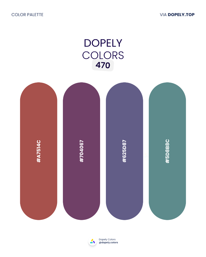
A quiet rainbow moving from terracotta through plum, slate blue, and teal — harmonious and emotionally resonant. Perfect for yoga studios, wellness brands, spa design, or cultural events. Subtle, layered, and deeply calming.
Palette colors:
- #A7514C — rgb(167, 81, 76)
- #704067 — rgb(112, 64, 103)
- #625D87 — rgb(98, 93, 135)
- #5D8B8C — rgb(93, 139, 140)
14. Dopely Colors 471 — Pale Air
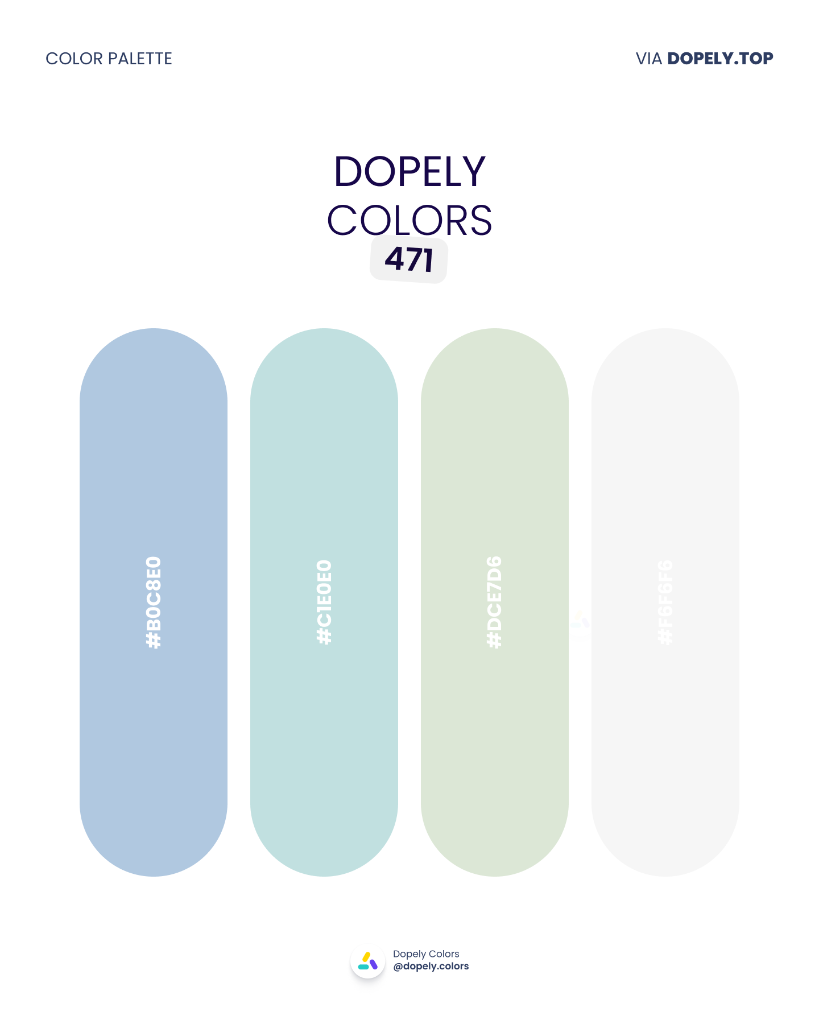
Sky blue, seafoam, morning green, and pearl white — an ethereal palette that breathes. Designed for meditation apps, digital health brands, modern clinical UI, or soft apparel. Take a deep breath.
Palette colors:
- #B0C8E0 — rgb(176, 200, 224)
- #C1E0E0 — rgb(193, 224, 224)
- #DCE7D6 — rgb(220, 231, 214)
- #F0F1F5 — rgb(240, 241, 245)
15. Dopely Colors 472 — Olive Garden
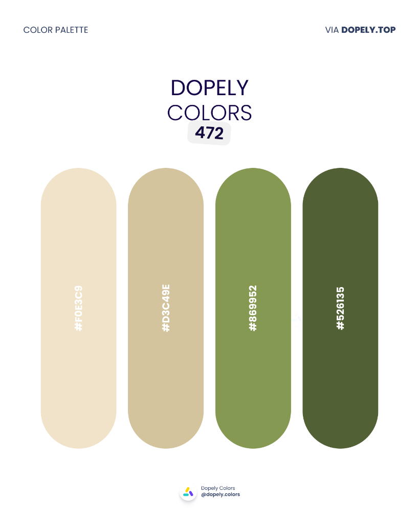
Wheat cream, natural beige, lively olive, and deep organic green — a palette that brings the farm to fashion. Made for farm-to-table restaurants, organic brands, earthy apparel, or nature editorial.
Palette colors:
- #F0E3C9 — rgb(240, 227, 201)
- #D3C49E — rgb(211, 196, 158)
- #869952 — rgb(134, 153, 82)
- #526135 — rgb(82, 97, 53)
16. Dopely Colors 473 — Ocean Depth
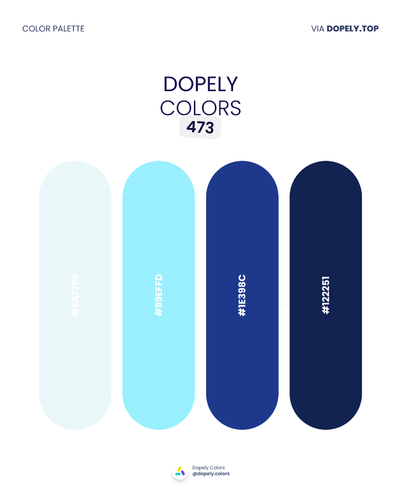
From icy morning blue to the deep ocean floor — a gradient from brightness to depth. Made for water technology, marine apps, data dashboards, or fintech brands that need to communicate trust. Blue always sells.
Palette colors:
- #E4F7F8 — rgb(228, 247, 248)
- #99EFFD — rgb(153, 239, 253)
- #1E398C — rgb(30, 57, 140)
- #122251 — rgb(18, 34, 81)
17. Dopely Colors 474 — Peach Bloom
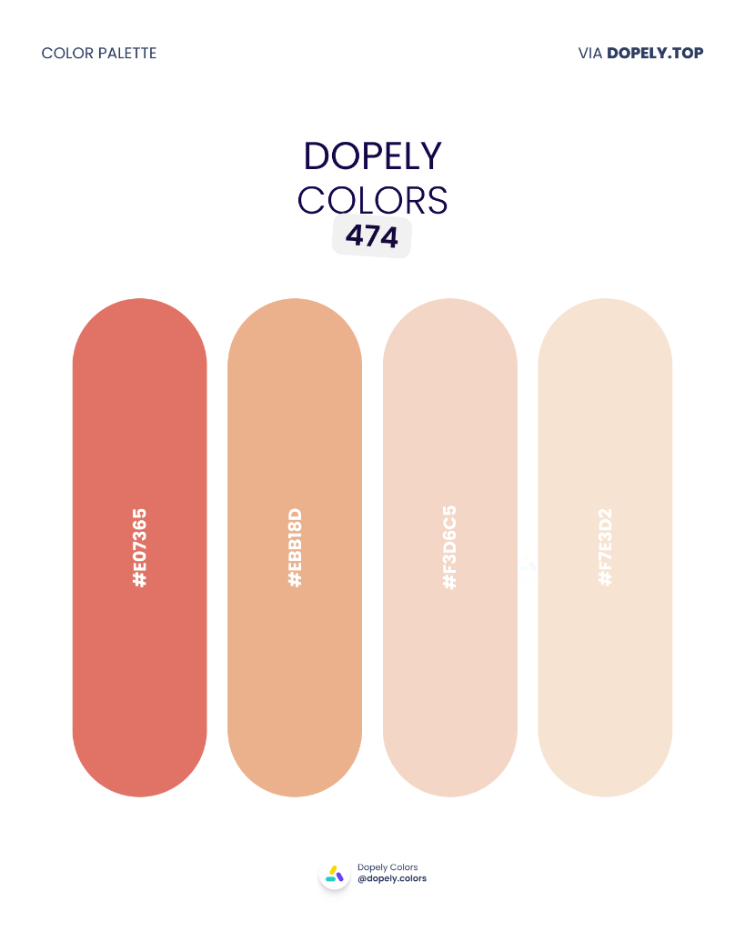
A single-hue flow from warm coral to cream peach — soft, warm, and inviting. Perfect for beauty brands, feminine interiors, maternal campaigns, or gentle packaging. A palette that wraps you in warmth.
Palette colors:
- #E07365 — rgb(224, 115, 101)
- #EBB18D — rgb(235, 177, 141)
- #F3D6C5 — rgb(243, 214, 197)
- #F7E3D2 — rgb(247, 227, 210)
18. Dopely Colors 475 — Violet Blush
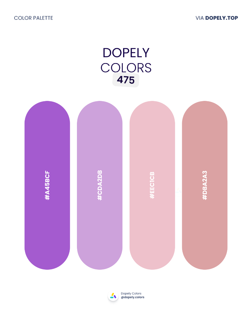
From electric purple to lavender to powdery pink — a feminine ombré with elegance. Great for modern beauty brands, Y2K fashion, pop music, or entertainment app UI. Trendy and timeless at once.
Palette colors:
- #A45BCF — rgb(164, 91, 207)
- #CDA2DB — rgb(205, 162, 219)
- #EEC1CB — rgb(238, 193, 203)
- #DBA2A3 — rgb(219, 162, 163)
19. Dopely Colors 476 — Twilight Mist
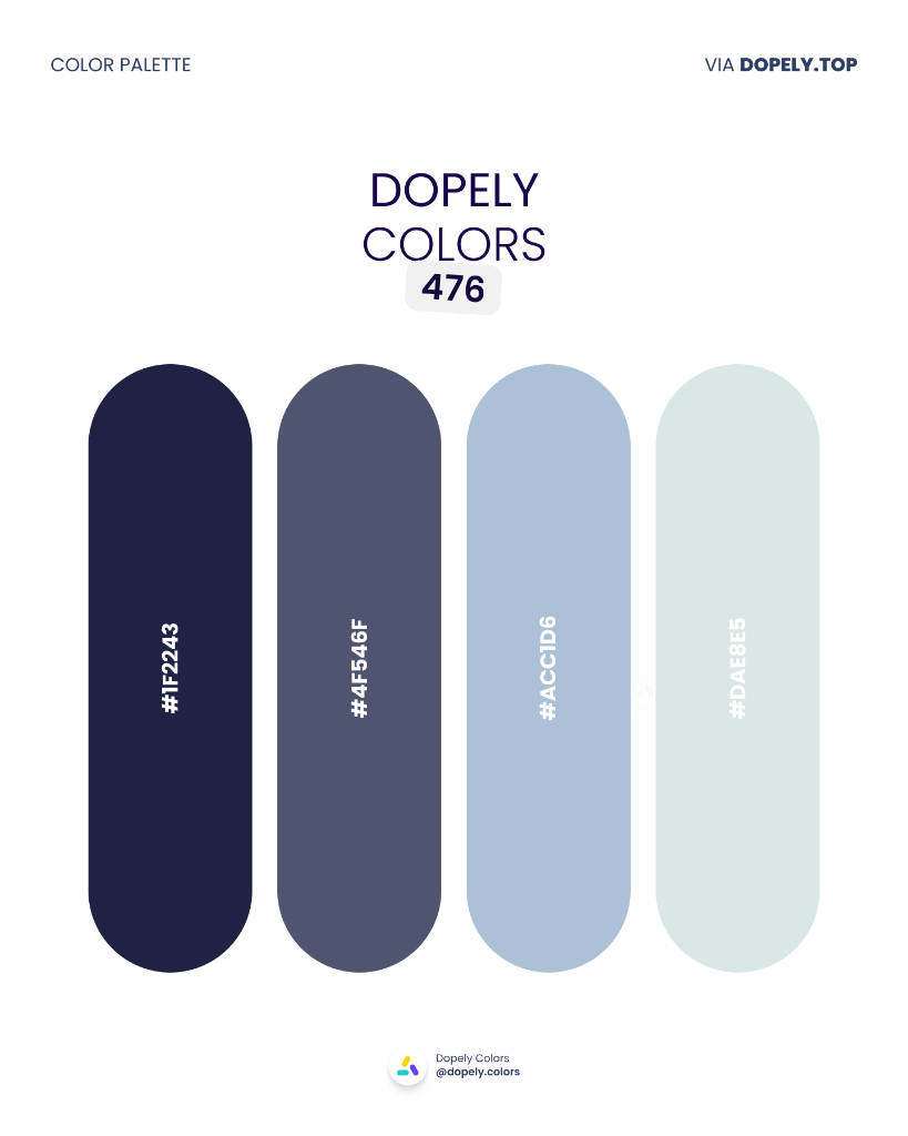
Night navy moving through slate blue to icy mint — like the horizon after sunset. For tech, dark-mode fintech, data dashboards, or corporate brands that want to feel modern without being cold.
Palette colors:
- #1F2243 — rgb(31, 34, 67)
- #4F546F — rgb(79, 84, 111)
- #ACC1D6 — rgb(172, 193, 214)
- #DAE8E5 — rgb(218, 232, 229)
20. Dopely Colors 477 — Electric Garden
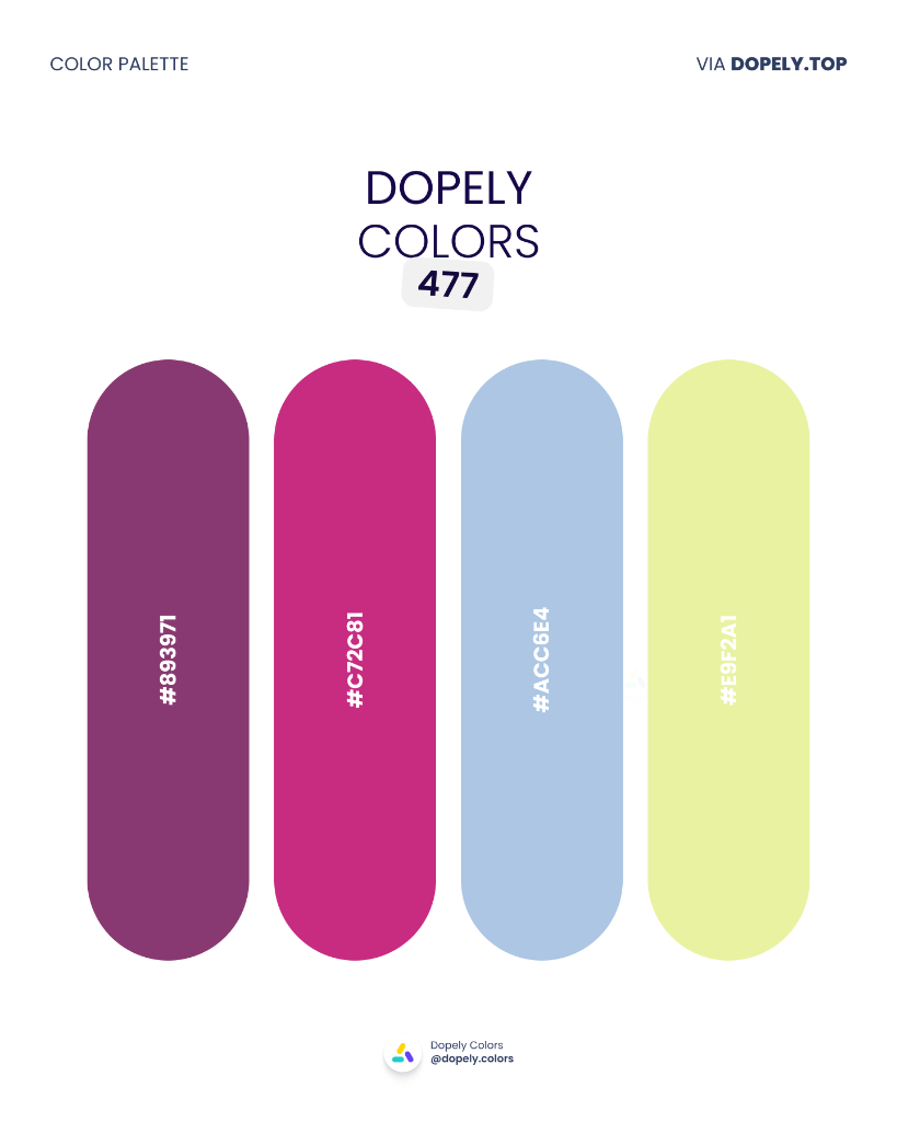
Deep magenta, hot pink, sky blue, and neon yellow-green — the boldest combination in this collection. Built for music events, gaming brands, Gen-Z products, or anything that wants to stand apart from the crowd.
Palette colors:
- #893971 — rgb(137, 57, 113)
- #C72C81 — rgb(199, 44, 129)
- #ACC6E4 — rgb(172, 198, 228)
- #E9F2A1 — rgb(233, 242, 161)
21. Dopely Colors 478 — Dark Forest Teal
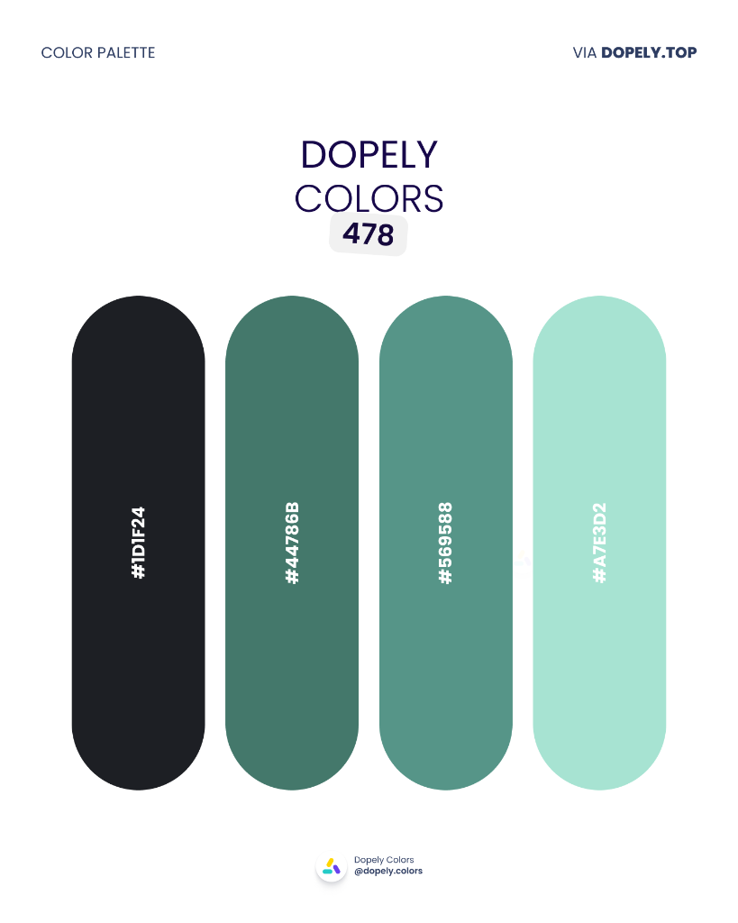
Graphite black, forest green, deep teal, and icy blue-green — a dark palette that breathes. Made for tech branding, dark-mode UI, luxury menswear, or sophisticated fintech companies.
Palette colors:
- #1D1F24 — rgb(29, 31, 36)
- #44786B — rgb(68, 120, 107)
- #569588 — rgb(86, 149, 136)
- #A7E3D2 — rgb(167, 227, 210)
Wrapping Up
Twenty-one palettes. One month. Infinite possibilities.
Whether you gravitated toward the commanding Bauhaus Bold (462), the serene Pale Air (471), or the moody Dark Forest Teal (478) — remember: a great palette isn't just about beautiful colors. It's about choosing colors that work together and work for your audience.
If you used any of these palettes in a project, we'd love to see it. Share on Instagram or Behance and tag @dopely.colors — we feature community work every week.
Until next time, keep exploring color.
All palettes are from the Dopely community. HEX codes extracted directly from the original palette cards.